Designs on paper are fascinating, but you really can't beat seeing them made real, can you? Which is why we get so excited in Chelsea week. And this year, with seven gardens and stands to supply, we've had plenty to get excited about.
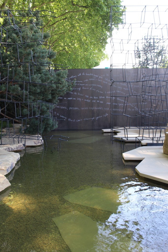
Designers Gavin McWilliam and Andrew Wilson really put us through our paces for Breaking Ground, using 10mm Steel Dark DesignClad engraved with script for the backdrop to heathland inspired planting.
“It's been a very interesting process,” says Gavin McWilliam. “We did extensive testing with Piotr [London Stone's Design Project Manager], Craig [our Garden Design Director] and Gavin [Production Director], testing different routing bits for the engraving. We wanted 2mm bits, but they kept snapping; London Stone wanted 5mm and we settled at 4mm.” This, we discovered in collaboration with Gavin and Andrew, gave the handwriting enough character, while remaining a practical solution to the task.
The garden highlights Wellington College's aim to break down barriers to education. “We asked students at the college for quotes about what they wanted to achieve in their lifetime and the importance of education,” says Gavin, “and scanned what they'd written. We wanted to keep the individual handwriting to make it more personal; print would have looked too corporate.”
The scans were converted into files for Piotr to work with on the CNC machine. “The whole experience was incredibly positive,” says Gavin. “Everything met its deadline; it was all packaged beautifully, and London Stone mounted the DesignClad on Tricoya®.” This will make the panels easier to relocate to Wellington College after the show.
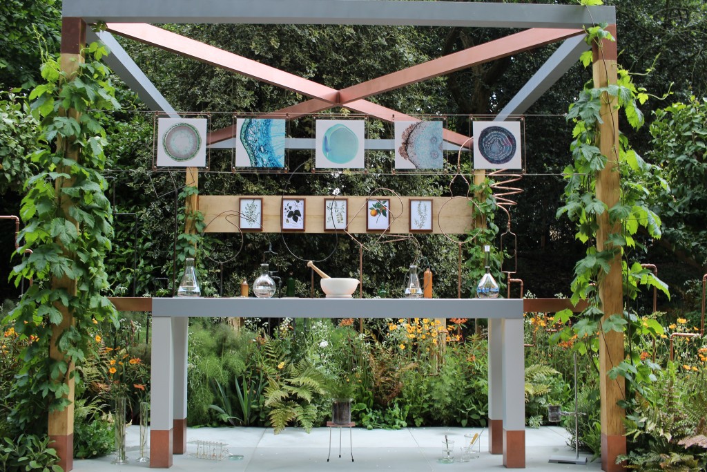
In the Artisan category, Catherine MacDonald used two finishes in her favourite stone for The Seedlip Garden. “I love Grey Yorkstone,” she says. The stand melded the ideas of medieval alchemy and modern chemistry for a design celebrating Seedlip's distilled non-alcoholic spirits inspired by the seventeenth-century work The Art of Distillation. With Seedlip's brand colours being green, grey and copper, the Grey Yorkstone complemented copper piping and plants chosen for their flavouring and medicinal properties.
Catherine used Premium Honed Grey Yorkstone under the modern lab benches and Sawn Grey Yorkstone beneath the condenser. “It subtly distinguishes the two areas,” she says, “and brings out the veining in the Sawn, while the Honed is slightly darker.”
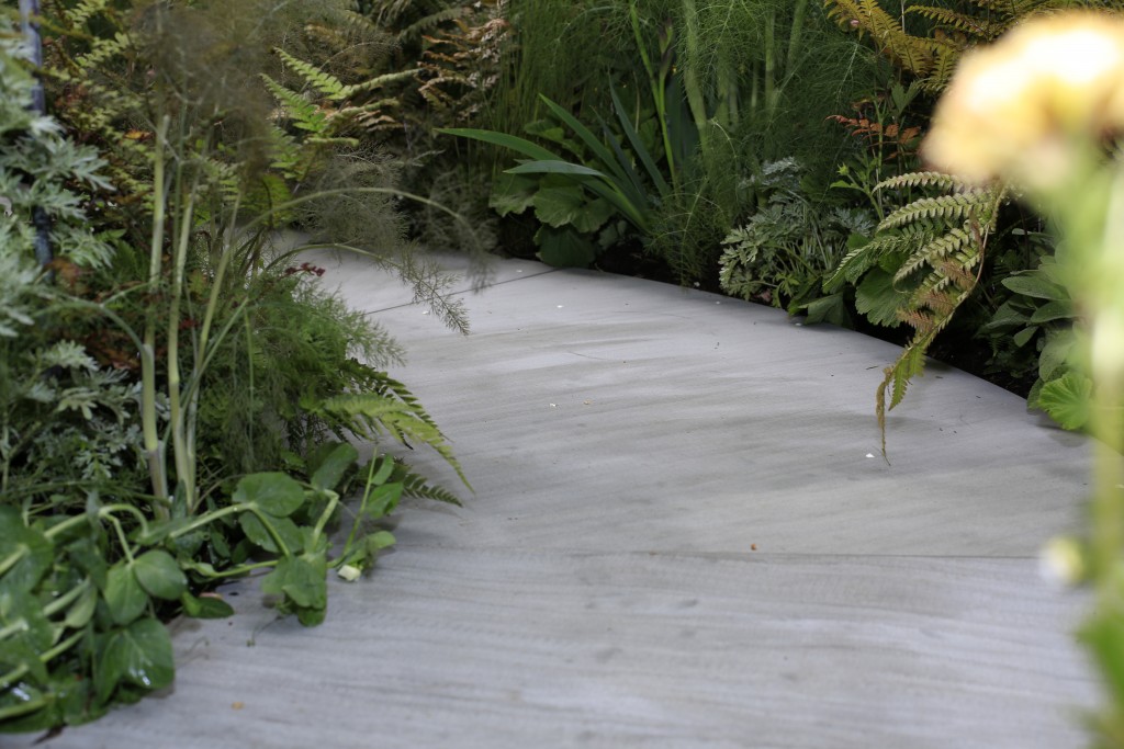
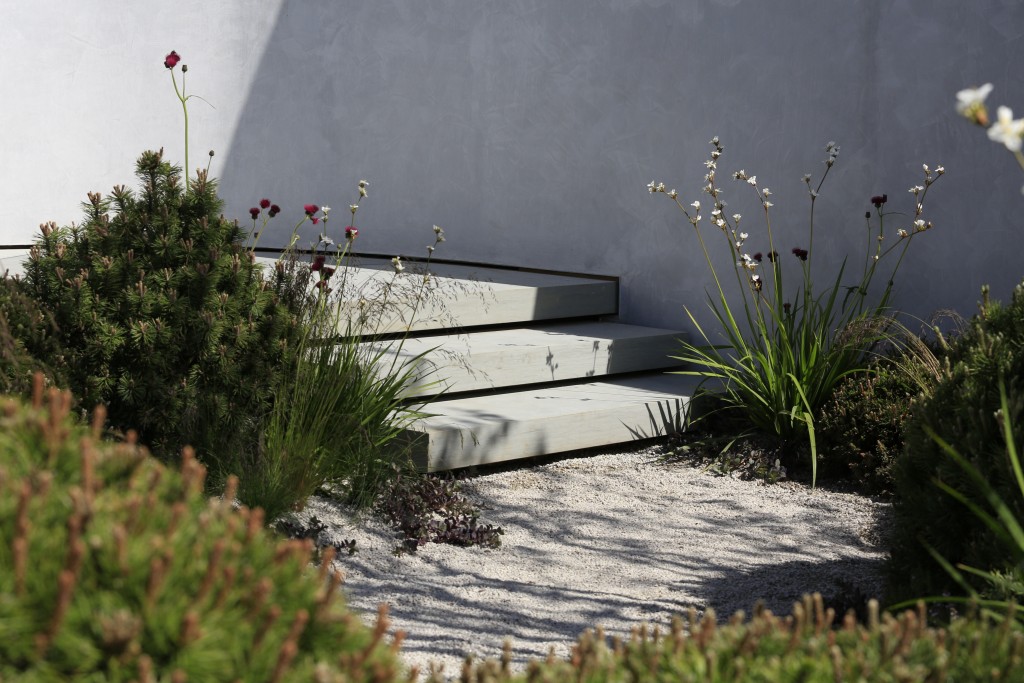
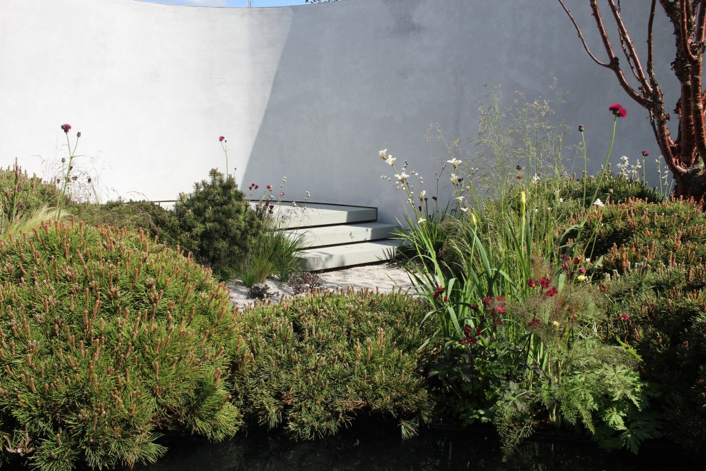
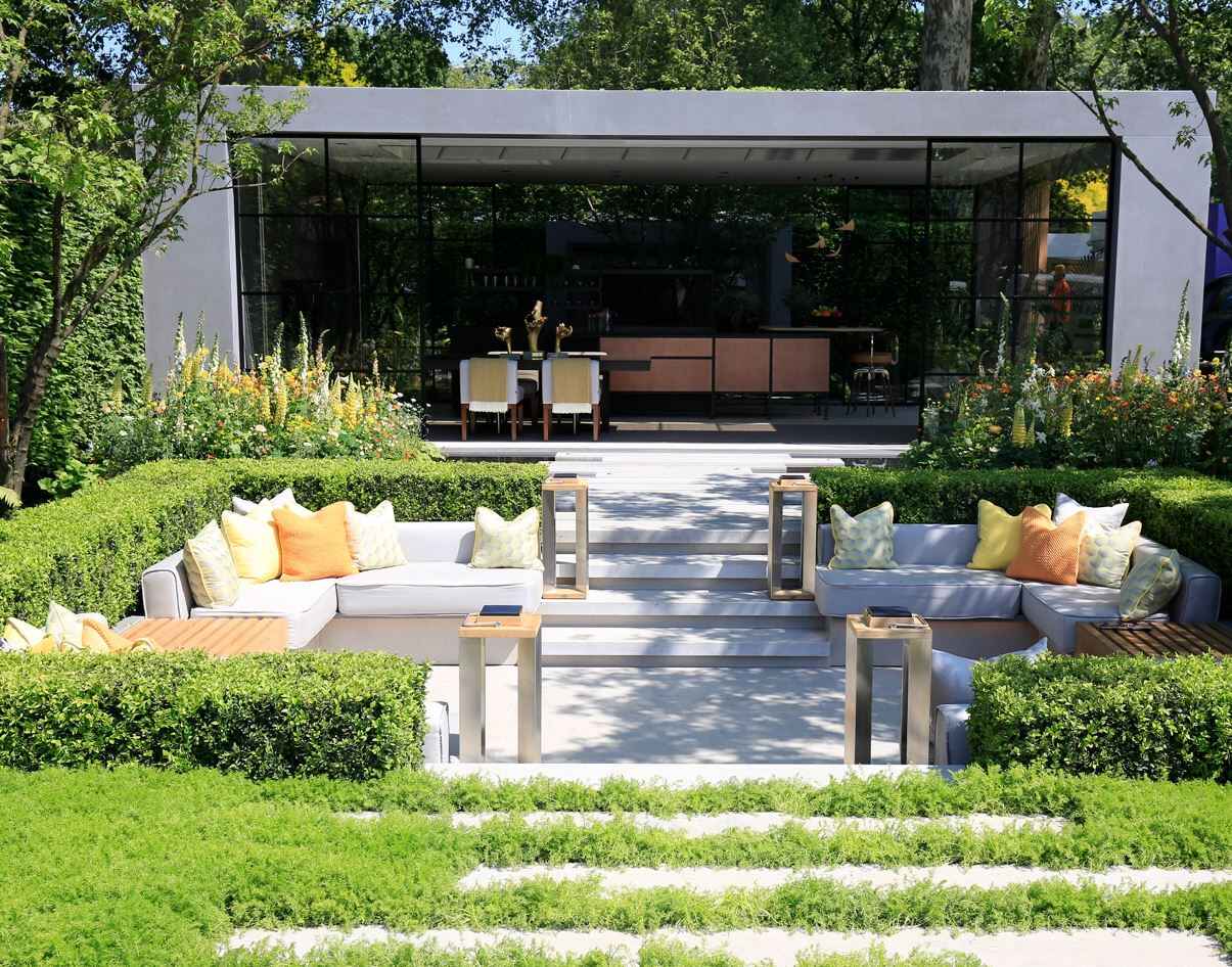
Matt Keightley used different finishes of Grey Yorkstone for a very different garden. The Jeremy Vine Texture Garden is one of five unjudged designs dedicated to the senses, celebrating Radio 2's fiftieth anniversary.
“We wanted the biggest possible slabs, and worked the design back from that. I know that, with Grey Yorkstone, the fewer joints, the more minimalist and contemporary it appears.” The result is huge, irregular-shaped slabs, with a small number of joints angled across the path, adding energy without detracting from the stone's smooth expanse.
The size of the slabs demanded forethought. With the largest originally weighing just under half a tonne and requiring six men to lift, we calibrated them down to 40mm for easier manoeuvring, while the steps offer a chunky 100mm profile.
Matt used three different finishes—Sawn, Premium Honed and Premium Honed with colour enhancer. “The different textures make the visitor pause and take in the garden at those points,” says Matt. The path both tapers and becomes subtly darker as it moves to the back of the design, giving the optical illusion of greater depth to the plot.
It had been intended to include DesignClad, not on the geometrically shaped back wall, but under the water. However, engineering practicalities and time constraints meant that this was changed on site, replaced with stones for a completely different texture. “It was a design flaw,” says Matt, self-deprecatingly. “It looked great when we tried it in the studio.”
Obviously, we were disappointed, but you can't argue with the results, which combine a multitude of textures into a welcoming garden that cunningly hides the endpoint of the path, enticing the visitor to explore.
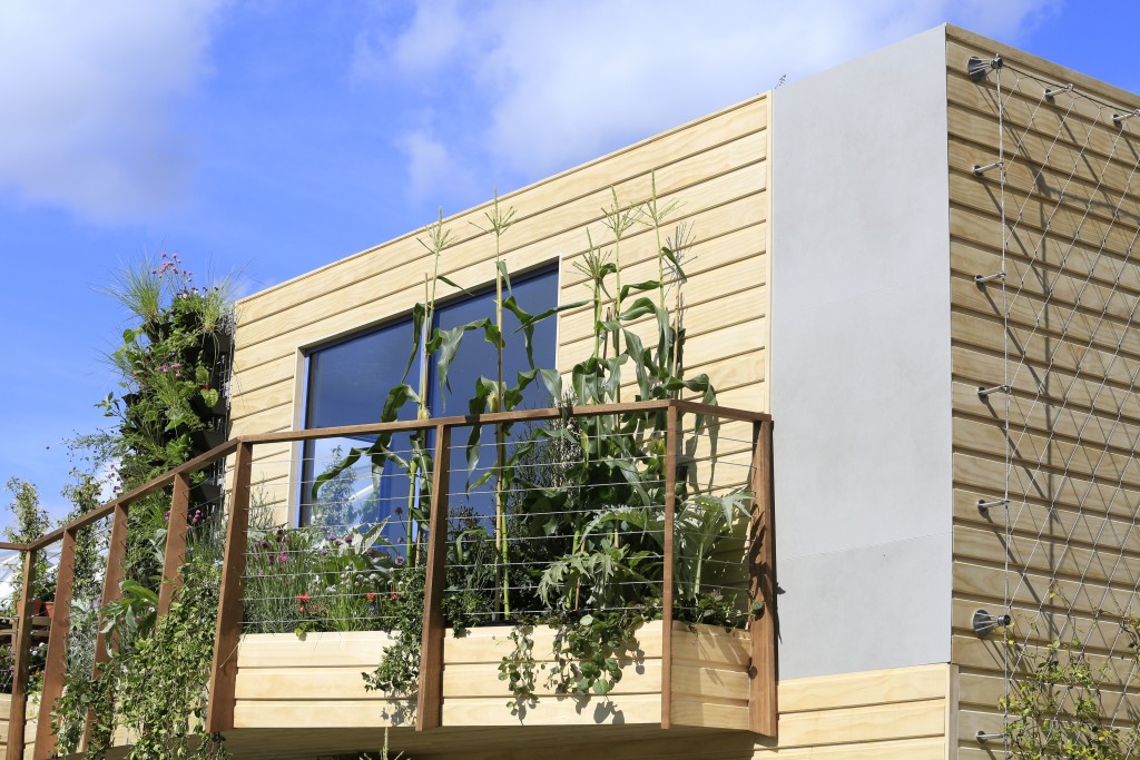
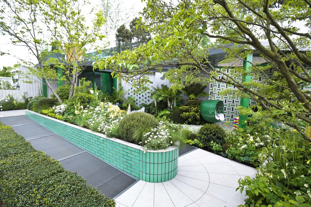
Greening the Grey, the unjudged RHS garden which demonstrates ways to bring nature back into urban and suburban surroundings, this year represented a communal area of an apartment block. DesignClad was ideal for facing the two-storey block, in contrast with wooden panels, as it's light and quick to install, without the stages required for traditional render.
The choice of Hydra Plomo gave a gentle, realistic backdrop to a garden that was full of clever ideas for creating a serene oasis that looked great from upper windows while nurturing wildlife.
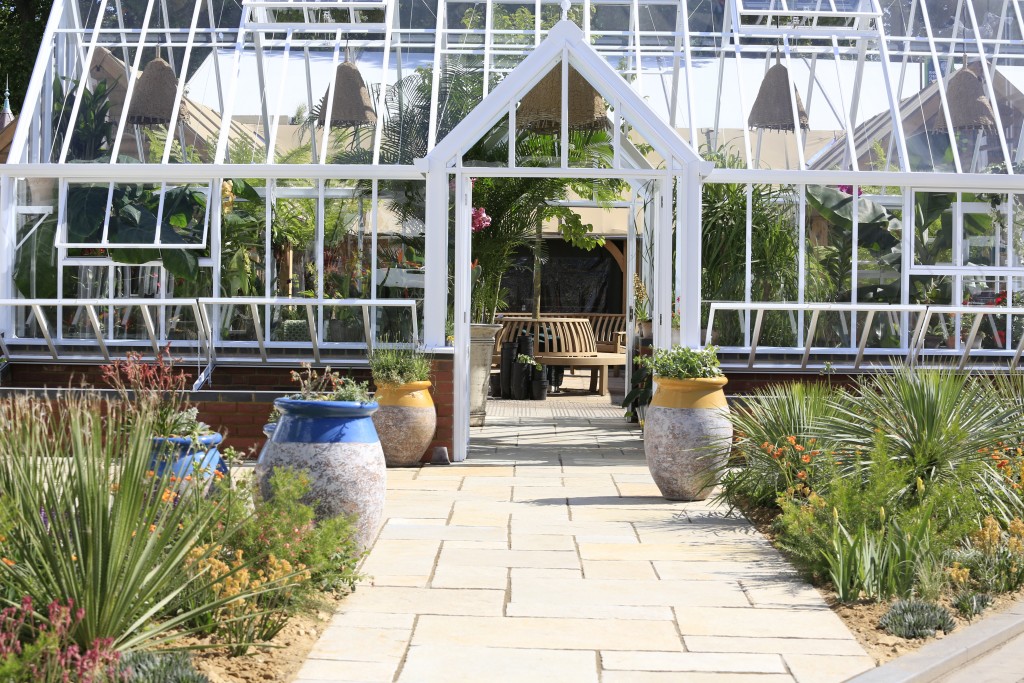
The Hartley Botanic trade stand is not only one of the largest on the Chelsea site, at around 200 square metres, but a slightly awkward wedge shape. No problem with that for designer Joe Perkins of Longview Design Ltd. It comfortably holds five greenhouses with, not only a different growing theme in each one but with very different styles, from the grand Victorian glasshouse, replete with decorative spandrels, through to a very modern orchid house in bronzed metal.
Uniting the whole, Antique Yellow Sandstone is used across the stand, giving a traditional feel that nevertheless adds warmth to the more modern structures, and contrasts well with the brick floor with which Joe paved the orchid house. The colour also gives a great backdrop to the arid feel of the planting, while the heavily tumbled profile makes a softer background for sword-like leaves.
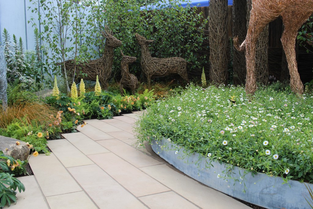
Emma Stothard is at Chelsea with her own stand for the first time, having featured in Chelsea gardens in past years. Designed by Alistair W Baldwin and built by Jody Lidgard of Bespoke Outdoor Spaces, the garden needed to provide a backdrop to her stunning woven willow and wire sculptures.
“I wanted a design that welcomed people onto the stand,” she said. The curved path is laid with Sawn Buff Sandstone Planks which are angled to lead the eye (and the feet) down the path to the classical pergola in woven willow. The precise cut of the sawn sandstone creates a good contrast with the sandstone boulders from Yorkshire that are set into the beds.
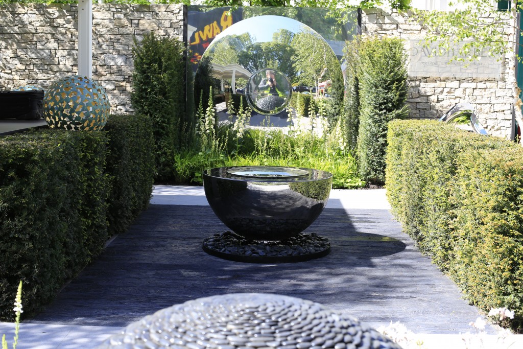
On David Harber's stand Nik Edser of Langdale Landscapes and designer Nic Howard worked to a similar layout to last year but produced a very different feel with Trendy Black Porcelain and Charred Oak Millboard, putting David's striking sculptures—including The Eclipse, this year's dramatic new design of interlocking rings—in a setting that really allowed you to appreciate them.
We modestly think we have a fan. “London Stone,” said Nic, “is so great to deal with, so professional, attentive and supportive. So many companies are not really on social media, but London Stone are outward thinking and always want photos of projects, featuring them online and in brochures.” Wow! Thank you, guys.
So, seven very different gardens, showing how materials can take on a different character when treated and used in different ways. We're always fascinated by the innovative feel that designers achieve with the stone we know so well.
As ever, this year's Chelsea designs offered us a challenge and, as you can see, we've risen to it, and especially with DesignClad, developed our skills with this new material even further. Both Breaking Ground and The Seedlip Garden earned Gold and we're delighted to have been involved in helping to make this possible.
Next up, Hampton Court! In the meantime, one of the most enjoyable parts of our job is working with designers to push the boundaries of what is regarded as possible. So, if you have a challenging idea, come and discuss it with us. We'll do absolutely everything we can to make it happen.


/filters:quality(60)/mediadev/media/menu-pics/all-porcelain.jpg )
/filters:quality(60)/mediadev/media/menu-pics/luxury-italian.jpg )
/filters:quality(60)/mediadev/media/menu-pics/premium-italian.jpg )
/filters:quality(60)/mediadev/media/menu-pics/budget-porcelain.jpg )
/filters:quality(60)/mediadev/media/menu-pics/large-format-porcelain.jpg )
/filters:quality(60)/mediadev/media/menu-pics/wood-effect-porcelain.jpg )
/filters:quality(60)/mediadev/media/menu-pics/porcelain-planks.jpg )
/filters:quality(60)/mediadev/media/menu-pics/porcelain-setts.jpg )
/filters:quality(60)/mediadev/media/menu-pics/browse-all-paving.jpg )
/filters:quality(60)/mediadev/media/menu-pics/stone-paving.jpg )
/filters:quality(60)/mediadev/media/menu-pics/interior-tiles.jpg )
/filters:quality(60)/mediadev/media/menu-pics/stone-effect-porcelain.png )
/filters:quality(60)/mediadev/media/menu-pics/wood-effect-porcelain.png )
/filters:quality(60)/mediadev/media/menu-pics/grey-porcelain.png )
/filters:quality(60)/mediadev/media/menu-pics/beige-porcelain.png )
/filters:quality(60)/mediadev/media/menu-pics/dark-porcelain.png )
/filters:quality(60)/mediadev/media/menu-pics/light-porcelain.png )
/filters:quality(60)/mediadev/media/menu-pics/patio-grout.jpg)
/filters:quality(60)/mediadev/media/menu-pics/primers.jpg)
/filters:quality(60)/mediadev/media/menu-pics/porcelain-blades.jpg)
/filters:quality(90)/mediadev/media/menu-pics/drainage.jpg)
/filters:quality(60)/mediadev/media/menu-pics/cleaners.jpg)
/filters:quality(60)/mediadev/media/menu-pics/all-stone-paving.jpg )
/filters:quality(60)/mediadev/media/menu-pics/all-sawn-paving.jpg )
/filters:quality(60)/mediadev/media/menu-pics/all-riven-paving.jpg )
/filters:quality(60)/mediadev/media/menu-pics/indian-sandstone.jpg )
/filters:quality(60)/mediadev/media/menu-pics/limestone-paving.jpg )
/filters:quality(60)/mediadev/media/menu-pics/granite-paving.jpg )
/filters:quality(60)/mediadev/media/menu-pics/slate-paving.jpg )
/filters:quality(60)/mediadev/media/menu-pics/yorkstone-paving.jpg )
/filters:quality(60)/mediadev/media/menu-pics/stone-pavers.jpg )
/filters:quality(60)/mediadev/media/menu-pics/cobbles-setts.jpg )
/filters:quality(60)/mediadev/media/menu-pics/plank-paving.jpg )
/filters:quality(60)/mediadev/media/menu-pics/paving-circles.jpg )
/filters:quality(60)/mediadev/media/menu-pics/bespoke-paving-1.jpg )
/filters:quality(60)/mediadev/media/menu-pics/edging-stones-1.jpg )
/filters:quality(60)/mediadev/media/menu-pics/prestige-stone.jpg )
/filters:quality(60)/mediadev/media/menu-pics/grey-blue-stone.png)
/filters:quality(60)/mediadev/media/menu-pics/swatch-black-dark.jpg )
/filters:quality(60)/mediadev/media/menu-pics/swatch-buff-beige-white.jpg )
/filters:quality(60)/mediadev/media/menu-pics/sealants.jpg)
/filters:quality(60)/mediadev/media/menu-pics/all-clay-paving.jpg )
/filters:quality(60)/mediadev/media/menu-pics/alpha-clay-pavers.jpg )
/filters:quality(60)/mediadev/media/menu-pics/cottage-garden-clay-pavers.jpg )
/filters:quality(60)/mediadev/media/menu-pics/kessel-garden-clay-pavers.jpg )
/filters:quality(60)/mediadev/media/menu-pics/artisan-clay-pavers.jpg )
/filters:quality(60)/mediadev/media/menu-pics/grey-blue-clay-paver.png )
/filters:quality(60)/mediadev/media/menu-pics/red-brown-clay-pavers.png )
/filters:quality(60)/mediadev/media/menu-pics/beige-buff-clay-pavers.png )
/filters:quality(60)/mediadev/media/menu-pics/composite-decking.jpg )
/filters:quality(60)/mediadev/media/menu-pics/designboard-decking.jpg )
/filters:quality(60)/mediadev/media/menu-pics/classic-designboard.jpg )
/filters:quality(60)/mediadev/media/menu-pics/brushed-designboard.jpg )
/filters:quality(60)/mediadev/media/menu-pics/grooved-designboard.jpg )
/filters:quality(60)/mediadev/media/menu-pics/millboard-decking.jpg )
/filters:quality(60)/mediadev/media/menu-pics/grey-decking.jpg )
/filters:quality(60)/mediadev/media/menu-pics/black-charcoal-decking.jpg)
/filters:quality(60)/mediadev/media/menu-pics/brown-decking.jpg)
/filters:quality(60)/mediadev/media/menu-pics/all-build-deck.png )
/filters:quality(60)/mediadev/media/menu-pics/stone-cladding.jpg )
/filters:quality(60)/mediadev/media/menu-pics/all-garden-walling-1.jpg )
/filters:quality(60)/mediadev/media/menu-pics/facing-bricks.jpg )
/filters:quality(60)/mediadev/media/menu-pics/garden-screening.jpg )
/filters:quality(60)/mediadev/media/menu-pics/all-steps-coping.jpg )
/filters:quality(60)/mediadev/media/menu-pics/stone-garden-steps.jpg )
/filters:quality(60)/mediadev/media/menu-pics/sawn-steps.jpg )
/filters:quality(60)/mediadev/media/menu-pics/riven-steps.jpg )
/filters:quality(60)/mediadev/media/menu-pics/yorkstone-steps.jpg )
/filters:quality(60)/mediadev/media/menu-pics/bespoke-steps.jpg )
/filters:quality(60)/mediadev/media/menu-pics/porcelain-steps.jpg )
/filters:quality(60)/mediadev/media/menu-pics/off-the-shelf.jpg )
/filters:quality(60)/mediadev/media/menu-pics/stone-coping.jpg )
/filters:quality(60)/mediadev/media/menu-pics/sawn-coping.jpg )
/filters:quality(60)/mediadev/media/menu-pics/riven-coping.jpg )
/filters:quality(60)/mediadev/media/menu-pics/yorkstone-coping.jpg )
/filters:quality(60)/mediadev/media/menu-pics/bespoke-coping.jpg )
/filters:quality(60)/mediadev/media/menu-pics/stone-pier-caps.jpg )
/filters:quality(60)/mediadev/media/menu-pics/porcelain-coping.jpg )
/filters:quality(60)/mediadev/media/menu-pics/all-bespoke-services.jpg )
/filters:quality(60)/mediadev/media/menu-pics/bespoke-paving-2.jpg )
/filters:quality(60)/mediadev/media/menu-pics/bespoke-steps-1.jpg )
/filters:quality(60)/mediadev/media/menu-pics/bespoke-coping-1.jpg )
/filters:quality(60)/mediadev/media/menu-pics/edge-profiles.jpg )
/filters:quality(60)/mediadev/media/menu-pics/masonry-services.jpg )
/filters:quality(60)/mediadev/media/menu-pics/deluxe-pergolas.jpg )
/filters:quality(60)/mediadev/media/menu-pics/proteus-pergolas.jpg )


